Basic & advanced customization
Introduction
We support two ways of customizing your Airy Chat Plugin. For most use cases the basic customization is all you need as it supports the essential options to customize the experience. If you need full control of every aspect of the plugin, we offer the possibility of advanced customization with Render Props.
How to customize the Airy Chat Plugin
Basic customization
After setting up your first source you can customize your Airy Chat Plugin to your needs.
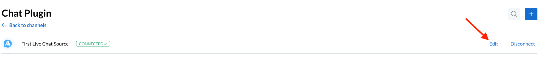
On your instance's Control Center, navigate to the Catalog on the left sidebar and select the Airy Live Chat connector.
Then click on Edit;
Switch to the Install & Customize tab and start customizing your Airy Chat Plugin to your needs.
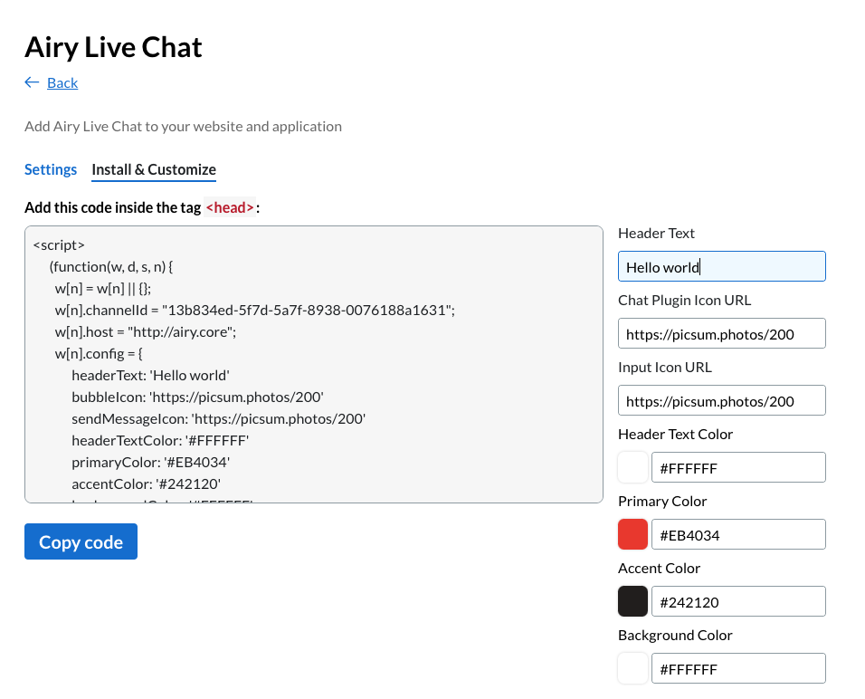
If you are happy with your customization, copy it and add this code inside the tag <head>.
| Config Key | Config Value | Config Description |
|---|---|---|
| welcomeMessage | JSON | Set the welcome message of your Airy Chat Plugin. It can be a text, a template, an image and more |
| headerText | string | Set the header text of your Airy Chat Plugin |
| headerTextColor | string | Set the header text color of your Airy Chat Plugin |
| subtitleText | string | Set the subtitle text of your Airy Chat Plugin |
| subtitleTextColor | string | Set the subtitle text color of your Airy Chat Plugin |
| primaryColor | string | Set your primary color as the topbar, border of textArea, Start new Conversation button text and border color, or text color of buttons |
| accentColor | string | Set your accent color as the sendButton |
| backgroundColor | string | Set the background color of the entire Airy Chat Plugin |
| outboundMessageColor | string | Set the background color of the outbound messages in the Airy Chat Plugin |
| inboundMessageColor | string | Set the background color of the inbound messages in the Airy Chat Plugin |
| outboundMessageTextColor | string | Set the text color of the outbound messages in the Airy Chat Plugin |
| inboundMessageTextColor | string | Set the text color of the inbound messages in the Airy Chat Plugin |
| height | number | Set the height of the entire Airy Chat Plugin |
| width | number | Set the width of the entire Airy Chat Plugin |
| bubbleIcon | URL | Set your company icon which appears on the button that opens and closes the Airy Chat Plugin |
| sendMessageIcon | URL | Set your icon as sendButton and replace the default paperplane |
| startNewConversationText | string | Set the Start new Conversation text button of your Airy Chat Plugin |
| disableMobile | boolean | Disable the entire Airy Chat Plugin for mobile devices |
| hideInputBar | boolean | Disables the input bar of the Airy Chat Plugin |
| hideEmojis | boolean | Disables the emojis in the input bar of the Airy Chat Plugin |
| bubbleState | 'expanded', 'minimized' | Set the behaviour of the chatplugin to be always expanded or always minimized |
| closeMode | 'basic', 'medium', 'full' | Choose one of the different option to close the chatplugin and start a new conversation |
Sample
| Default Style | Customized Style |
|---|---|
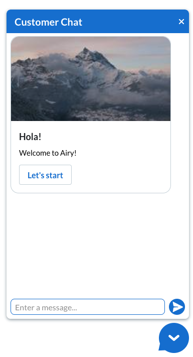 | 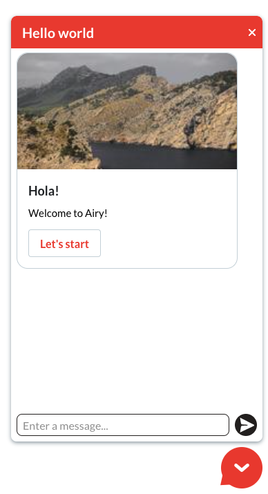 |
Advanced customization
Installing the Airy Chat Plugin as a library allows you to customize the interface as much as you want using Render Props. The Airy Chat Plugin provides you with four Render Props. All Render Props parameters are optional. If you omit all of them, the Airy Chat Plugin will render the default styling and behavior.
Each Render Prop accepts a set of parameters that allows you to customize the interface or the behavior of the Airy Chat Plugin.
| Render Props | Description |
|---|---|
| headerBarProp: (orgImage, toogleHideChat) | Optional. Top bar component of the Airy Chat Plugin. Can minimize the full plugin and display a custom image as brand icon for your organization orgImage : image url toggleHideChat() : function that will close or open the Airy Chat Plugin |
| inputBarProp: (sendMessage) | Optional. Input field that accepts a message and the onSubmit action that sends the message. sendMessage(text) : function that sends a message to the server. It takes a string as parameter |
| airyMessageProp(message) | Optional. Welcome message to display in the conversation. message : message.payload |
| bubbleProp: (isChatHidden, toggleHidechat) | Optional. Area used as a toggle to open and close the chat and also a brand icon. isChatHidden : boolean value that indicatas if the chat is closed or open. toogleHideChat() : function that closes or opens the Airy Chat Plugin. |
Example of how to use Render Props with the Airy Chat Plugin library:
const airyChatPlugin = new AiryChatPlugin({
  organization_id: "YOUR_ORG_ID",
  app_id: "YOUR_APP_ID",
  app_secret: "YOUR_APP_SECRET",
  headerBarProp: ({orgImage, toggleHideChat}) => (
    <div className="customHeaderStyle" onClick={toggleHideChat}>
      <h1 className="customHeaderTitle">Title</h1>
      <img src={orgImage} alt="orgImg" />
    </div>
  )
});